Paris-based motion design studio Parallel has a complete collection of…disappointment.
In an accurately unsatisfying manner, the actions included within this short piece are frustrating unfinished, or gone awry, in a way that leaves you wanting a different outcome.
It’s a clever and goofy creative project, and leaves us wanting satisfaction with our actions. Via Colossal:
Swiss designer Roger Reutimann’sYAWN is a hand-cast concrete nightlight with two softly glowing “eyes” — and somehow, despite being made of a material we associate with parking garages, it manages to feel genuinely alive.
Each lamp is cast entirely in Reutimann’s studio: custom molds, vibration techniques to eliminate air pockets, multiple rounds of sanding and sealing for those crisp, clean edges.
The “eyes” are diffused resin lenses with dimmable, smart-home compatible LEDs, cleverly buried inside the solid concrete body without compromising the structure or the silhouette.
Yawn is a sculptural nightstand lamp shaped from strict geometry – stacked blocks, sharp right angles, and a cantilevered vertical that feels architectural. Cast in solid concrete, the form reads as heavy, precise, and unapologetically industrial, echoing the Bauhaus belief in clarity, structure, and material honesty.
At the top, the severity breaks. Two recessed, softly glowing “eyes” sit beneath a thick, brow-like overhang, giving the piece an unmistakable expression. The posture feels tired, slightly slouched—more attitude than character—introducing a dry, understated humor that contrasts with the rigid geometry.
The result sits squarely in the Bauhaus spirit I admire: disciplined, functional, and stripped down—yet human enough to feel alive.“
What gives YAWN its personality isn’t decoration. It’s geometry. The slight cantilever, the paired light sources, the proportion of the whole thing conspire to suggest a sleepy blink or a yawn through restraint rather than theatrics. Very Bauhaus. Very good.
Limited to 100 hand-made pieces. The kind of thing you’d put on your bedside table and feel slightly reluctant to turn off.
That seems to be the M.O. behind Vanessa Mckeown’s delightful absurdity. Her mashup images combine objects in nonsensical yet logical ways.
From taps pouring pasta to skinny baguette legs, we see her creative and humorous range. Always cleanly created and beautifully photographed, there’s a studio quality that adds a plausibility to these moments. Thankfully she offers prints of her work, so you can add some needed levity and humor to your home.
See much more of her hilarious creations on her website and Instagram.
The day that a lot of kids look forward to most, Halloween, might be quite a bit less exciting this year. Trick or treating during a pandemic doesn’t seem like a great idea for most.
Luckily there are some ingenious ways to send treats to kids, and provide a fun scare at the same time.
This Halloween zip line is accompanied by a ghost-like creature who zooms out to the sidewalk to deliver treats. In this early test, it looks like it’s also delivering a beer to an accompanying father, which gets thumbs up from us too.
Pandemic Halloween is behind us, but the rig has outlived its moment. Candy chutes, ziplines and porch cannons turned out to be more fun than a bowl by the door, and plenty of houses kept them. For more of the season, see our favorite Halloween GIFs and vintage postcards from the witching hour.
We’ve never been to a national park and not come away in awe. The natural beauty, scale, and diversity of landscapes always blows our mind.
But you can bet there’s always someone out there oblivious to the beauty, probably preferring a shopping mall to a hike in the woods. Those people are terrible. But they also make for hilarious tongue-in-cheek posters, created by Amber Share, who gathers real 1 star reviews of these places on Yelp. She creates hilarious, hand lettered posters decrying the Grand Canyon “A hole. A very, very large hole.”
The project is called Subpar Parks. What started as a lettering exercise on Instagram grew into a bestselling book in 2021, then a second volume covering parks around the world, plus enough postcards, puzzles and prints to fill a ranger station gift shop. Share’s trick is that the posters are sincere. The landscapes are drawn with real affection in the style of the WPA park posters of the 1930s, and only the words are dumb, so the joke is always on the reviewer rather than the place. Check out more of her work on Instagram at @subparparks.
In a clever ad campaign for Berlitz language school, we see people who have pretty much blended in/transformed into office furniture, going unnoticed because of their lack of language skills.
It’s a funny way to showcase the idea of going unnoticed, and is effective at making the figure seem unimportant and insignificant. Via Behance:
When you don’t speak English, taking part in conversations can be hard and even more so in business contexts.
In a visually hilarious yet brilliant series, Canadian photographer Libby Oliver showcases figures wearing every single piece of clothing they own. Entitled Soft Shells, the series is deeper than it might seem, as Oliver describes the thought process behind the seemingly lighthearted project. Both a reflection of consumerism and a way to showcase the elements of a person’s style, Soft Shells is more than just comically draping someone in piles of clothes. The photos become reflections on personality, attainment, collection, and status, while also creating a sense of anonymity that hides the faces from view. Fascinating art, via Chew on This Art:
“Clothing grounds us to our notions of self and works to cue others to our chosen identity narrative.”
“Our garments work to project the uniqueness of our identity while simultaneously seeking approval and acceptance into various social groups.
What we wear is thus both an exercise in our creative individual autonomy and a system of social surveillance and categorization.”
Japanese artist Yukiko Morita has a funny and beautiful new concept with her “Pampshades”, lamps made from real baked bread. Using her experience as a baker, Morita bakes the bread, carefully carves out the interior, embeds LEDs and batteries, and then uses resin to seal the baguettes up, ensuring they won’t decay.
The result is a surprisingly beautiful glow, and the texture and form of the bread creates unique patterns and light that are one of a kind. Read more about these baked beauties on DesignBoom:
This tongue-in-cheek project by Scott Kelly and Ben Polkinghorne takes beautiful natural places and other amusements and adds a physical recommendation board that mimics the kind of online recommendations you’d see when browsing places on the internet.
A giant wooden sign on the beach recommends additional beaches and waterfalls, just like a visit to Trip Advisor might offer you.
The result is obtrusive, foolish, and also clever, making people pause and realize just how pervasive the internet is in our lives. Via The Verge:
Miguel Vallinas has a sense of style, and a sense of humor. It shows in his strange, funny, and fascinating series Roots, which showcase people in all manner of fashion with giant bouquets of flowers for heads. Set on an all-black backdrop, the figures stand with their hands behind their backs, posing upright for the camera. Huge, overflowing bouquets of flowers and grasses erupt from their necks, immediately turning this fashion shoot into something else, something that requires some abstract thought. And hopefully a smile. Via DesignBoom:
In an accurately unsatisfying manner, the actions included within this short piece are frustrating unfinished, or gone awry, in a way that leaves you wanting a different outcome. It’s a clever and goofy creative project, and leaves us wanting satisfaction with our actions. Via Colossal:
Tony Luciani created a very touching, funny, and quirky series of photos with his 91 year old mother. As her full-time caregiver, Luciani created a collection called The Strange Ones, allowing his mother to be playfully bizarre, and create a legacy of humor and fun, in the later years of her life, dealing with dementia. Via MyModernMet:
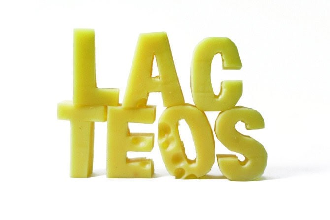
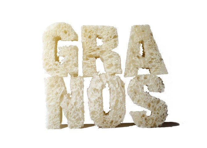
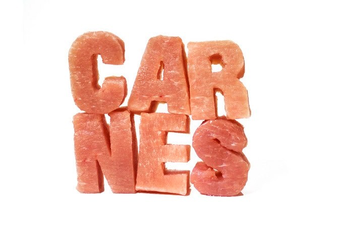
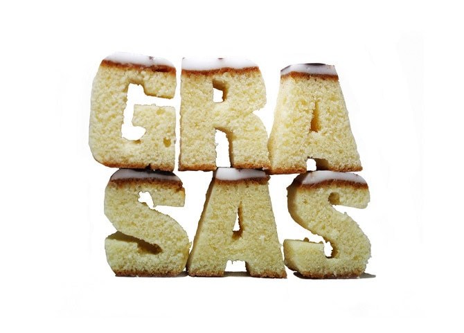
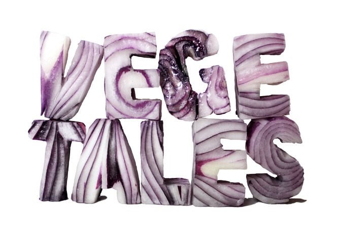
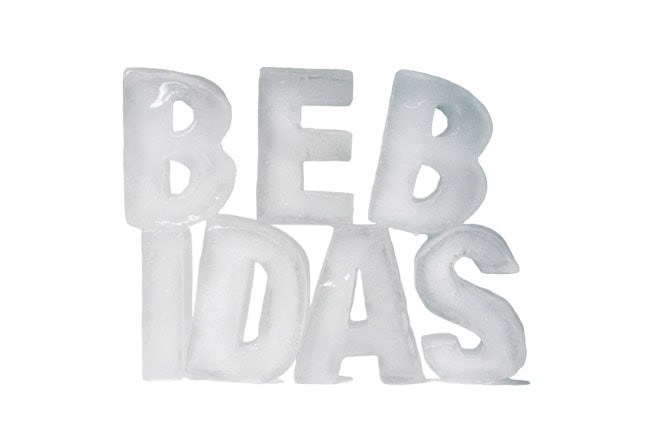
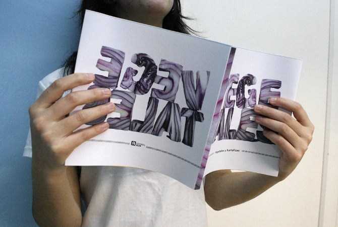
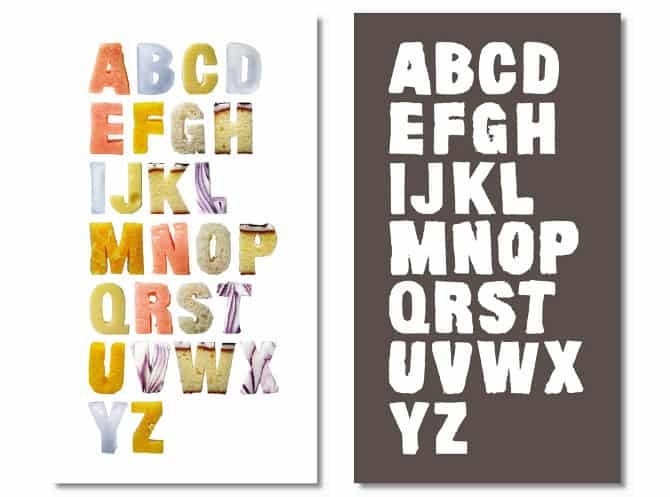
Food Type (translated)
Designing a typeface for a specific project and their subsequent implementation.
The project is a collection of books on healthy eating. It consists of seven books, each devoted to a group of the food pyramid.
The font then is cut in foods from each group (cheese dairy, orange fruit, ice drink, onion plants, etc..). Notably, the typesetting are not retouched, but were in the same position at the time of taking pictures.
The result is an image that works on its own in each of the covers.
Wedding photos, jeeze they sure get boring. No, I’m not hatin on true love, but people, those overly heart-throbby airbrushed galleries make us want to puke. Thanks to this couple for keeping some humor, creativity and originality alive, even on the day of nuptials.
The NY Times has an ongoing “Great Homes and Destinations” feature, and today’s home was from Berlin. A beautifully modern, restored space that served as a laundry for 100 years. I’ve known that Germans have a great eye for design, but perhaps not as much for whimsy or color.
But this house scores on a number of levels, and wins big with a fabulous ‘Robin Hood Fox’ sculpture by painter Daniel Richter. Just look at it! The fox has a couple of injuries that have been wrapped, and he’s using a stick as a cane.
His green cap is artfully perched on his head, with his face holding an expression of indignity and pride. I love it. He takes his place among beautiful hand-made couches that bring warmth and sensibility into the space. Gorgeous.